Each year in July we have a cook off between the different departments within ScreenPrinting.com. Marketing and Web got the honor to kick it off this year with the food theme: Caribbean. We made many yummies, It was a hit and everyone had a great time.
But since this is Marketing and we are all on the creative side, we HAD to make t-shirts for everyone to wear. It was a moral imperative that we do so. So we all got together to brainstorm ideas…. And you all know how THAT goes! Multiple people start throwing in ideas - Lions! Rasta Colors! Steel Drums! Music! Keep it to no more than 2 screens, lists upon lists are created to make sure every voice is heard. These ideas get stirred up and digested, goes through a committee process for multiple reviews, changes are requested, and…. Yea, screw that.
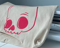
I worked directly with the awesome Artist Extraordinaire Cristen to take these concepts and see what we could do together. Very quickly we realized our design tastes were taking us in a radically different direction and our love of color was making this “simple idea” very complex. We pulled design elements from multiple sources and pieced together a couple of ideas that we thought were working pretty well…. Then we stumbled across our main design element. A Cthulhu inspired Octopus design. We decided to run with that, focusing on nautical and water elements, we tried to work in some Atlantis themes (did not fit with the artwork), and figure out the wording that we wanted to incorporate.
With this being a food themed event, we decided on the core verbiage: Feed Your Brain. We were inspired by feeling Hangry and Snickers commercials. Not to mention, that phrase feeds directly into a core value of Ryonet: Education. Feeding yourself knowledge and understanding. When we don't understand what's going on on press, we as printers tend to get frustrated and unhappy - Knowledge Hangry - Time to Feed Your Brain! Our tagline is Defeat Your Inner Beast. Both lines played very well off of the main image and still tied in nicely with the Education core Value.
 |
 |
We settled on the main design elements above. Cristen pulled border elements together, did a little clipping and tweaking and sent me her final design. I took that and started to embellish it, adding a black outline for higher contrast and tweaking the text effects so it popped off the shirt more, giving it more of a retail feel. I strongly thought about adding a LOT more photoshop effects to the design to give it a far deeper 3D effect creating depth and weathering of the border etc... But, time constraints started to rear their ugly heads and I kept it fairly simple.
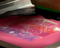
We knew we wanted to print with the Green Galaxy Fusion inks. But since we would be printing this job on a Manual Press (Riley 350), we didn't want to make too many screens. Even though Green Galaxy has the best screen open time on the market, wb inks can still dry on and in the mesh when it's hot and dry. (When I actually started printing this it was about 80*F and the humidity was about 35% which is pretty dry!)
Since the background of this design has a lot of grey elements and there is no white in this design, I decided to use a light grey as my base. This left black and 2 colors. We decided this would look good and separated the design (by hand) into the following 4 screens. We printed the films at 55lpi and 22.5* angle for all.


- Grey Base (Close to cool grey 3 or 4) - 156 Saati Hy-Dro mesh
- Made from Comet White and 1% Fusion Black
- Flashed until dry to the touch.


- Pitch Black - 230 Saati Hy-Dro mesh
- Flashed until dry to the touch


- Gold - approximately PMS 128c - 230 Saati Hy-Dro mesh
- Flashed until dry to the touch


- Green - approximately PMS 7738c - 230 Saati Hy-Dro mesh
- Flashed before running through the dryer.
This sounds like a cop out, but I deliberately didn't pick a specific pantone. I wanted to see how the ink looked when printed and allow for color adjustments on the fly. I did end up adjusting the Gold and Green once I started printing. To the gold, I added more red and the green I added more yellow. Printing over an underbase will ALWAYS shift the color and creating adjustments to the ink is needed with all ink systems.
With HSA WB inks you will almost always double stroke your colors to maintain color vibrancy and I did that with this design. While the Green Galaxy system can definitely be printed wet on wet, or wet on dry if your platens are hot enough; I decided to keep this approach simple since I did not need to do anything super in depth for color development, so I flashed in between each color. If this was on a ROQ press, I would have run 2 flashes and kept my platens hot during the printing process.

(The final design)

Cure took place through our Aeolus forced air electric dryer. Since I was not running high production numbers I could be a little gentler on heat and allow the shirts maximum retention time in the tunnel. The Aeolus dryer has dual zone heat control. The settings for the first 2 panels were 600* and 580* for the last panel, retention time was 2 minutes and 10 seconds.
When creating my dryer setting I always use a donut temperature probe. I measured the ink temperature hitting 320* and recorded how long it was at or above 320* - on this design we held at or above cure range for 25-35 seconds. Maximum temperature swings were in the 340*-350* range. The reason for the swings in temperature and time at temperature is directly related to how electric dryers (all dryers in actuality, it's just a bigger swing with electrics) react to temperature swings.