
Screen printing master Colin Huggins is here with another deep dive into artwork! In the latest video, Colin explains how to do color separations for blending and halftones in Adobe Illustrator. He shares insights about the techniques that'll dial in your design and make it ready for perfect blending. Take a look!
In the video, Colin uses a design from the Monoline Adventure Pack, which includes the Abonar font (both are available for you to download). He takes the design and inputs his own colors to his own liking.
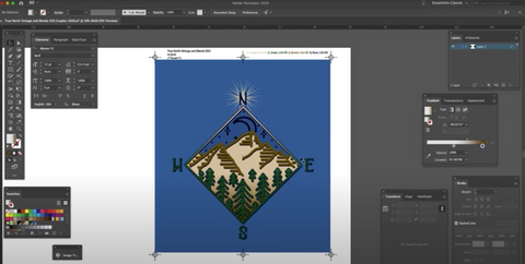
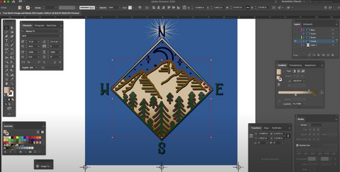
In the design, Colin blends the cream color in the mountains and the diamond outline. He also fades out the star behind the "N".
PHOTOSHOP VS. ILLUSTRATOR
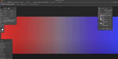
Separating blends is doable in Photoshop and in Illustrator. For a visual demonstration of what the dots will look like, Colin creates a separation in Photoshop that matches the film output. You'll notice in the middle of the blend, the color is muted, almost whitish. You don't want that. Your customer doesn't want that. As you can see, when he moves the design over — creating heavier overlapping of the physical dots — you can see the colors become more saturated. (If you just want to watch it, he starts discussing this topic two minutes into the video.)
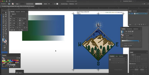
To make that happen, first create a layer for each of the colors you want blending in and out of each other.
Go to the gradient menu and adjust the midpoint. Adjust the midpoint so that the two colors overlap. For example, Colin bumped up the midpoint on the cream and the brown within the mountains. He moved the midpoints to where the brown and the cream are 70%. The two colors overlap and eliminate that white, empty space in the middle.
LEARN HOW TO DO SIMPLE COLOR SEPARATIONS IN ILLUSTRATOR
IMPORTANT TO NOTE
The LPI, the size of the dots, will impact where exactly you drop the midpoint. The higher LPI, the less you'll need to move the midpoint. The mesh count will affect which LPI you pick. Colin plans to use a 230 mesh, so he may make the design 40 or 50 LPI.
The design Colin created is meant to be printed without a white base. If you need a white underbase for the print, you'll have to more the midpoint elsewhere. Where exactly depends on you.
LEARN HOW TO CREATE A WHITE UNDERBASE IN ILLUSTRATOR
Lastly, just try it out and play around. Discover how it looks on press. Make adjustments and try it again. Experiment and play to hone in your skills and process. Halftones are not easy to print! The more you practice, the better you'll get. Good luck, printers.
Find these videos helpful? Make sure you subscribe to our YouTube channel and sign up to receive notifications to know when we share our latest videos.