You’ve just bought the Green Galaxy® Fusion Mixing System…now what?
If you’ve selected your color and are ready to pull your scale out and start a rainbow chemistry lab, you’re on the right track.
All you need is:
– A gram scale (least 0.1 g (optimal .01 g)
– Empty containers for mixing and storage
– Mixing spatulas
– An attention to detail and a good eye
The Green Galaxy® Fusion Mixing System includes a convenient online app with pre-programmed color formulas. This is the easiest method to use when mixing your own custom ink colors, and your color accuracy is more or less based on your mixing abilities.
The Fusion mixing app is fairly simple to use. Just type in the number of the Pantone® color you want and the volume of ink you are mixing for. The program will give you the ratios of each pigment you need to create that color.
Once you decide on your color and find out the formula needed to create it, you simply need to start mixing.
It’s best to have an area set aside dedicated to ink mixing, especially if you plan to use the Fusion Mixing System as your standard ink creation method. A surface covered with platen paper or an easy-to-clean area is best. Make sure that it’s well lit with light as close to sunlight colored light (5000K) as possible. In reality, a good mix between incandescent and fluorescent light will be enough to help you catch any inconsistencies in your color mixing, but putting yourself near a window or checking your color in natural light is always a good idea.
To mix:
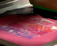
Zero out your mixing container, and add in the base and pigments one at a time, following the formula’s ratios. It can be helpful to go from light to dark, watching the color develop as you go. Once you’ve mixed your color, test it by spreading a small amount of the final color on a white strip of paper or pellon. Compare the mixed color to your Pantone® target color in good quality light. If you’ve got a match, then your next step is to test your newly mixed color on your garment!
Trouble?
Sometimes you may find that your perfectly matched Pantone® color looks off when placed on a different colored garment. This is because color is subjective. The same orange will appear to be different on a white background than when placed against a lime green one. If you have especially picky customers, it’s better to always test your mixed color against the target garment for your sample, and make sure that your customer doesn’t come back with a whole order of “misprinted shirts”. If you do find that your color looks off, you may need to adjust the formula slightly to compensate. Usually, it only requires a small adjustment that can save you hours of headaches later.
Still not right?
Submit a correction request through the Fusion mixing app and ask for an updated formula.
To do this, fill out the information in the Pantone Formula Feedback option and choose your request type:
– Urgent – I need this ASAP
– Standard – I need this in the next business day or so
– Feedback – I made this formula better.
Let us know what is going on and we will work with you to get the right color quickly.
Your feedback is always appreciated so if you made this formula better let us know! We would love to update it in our system and bring in your comments once we verify everything.