
Halftones are utilized in many screen print shops. They create crazy details that can be screen printed onto a garment. But what are halftones exactly? How are they created? Let’s dive in and find out.

WHAT ARE HALFTONES?
Halftones are a mathematical dot pattern that represents the grayscale value of a color and are created based on a grid. Printers can rotate the grid to change the angle, lines per inch, and more. This dot pattern can be so tiny that it appears as a regular image, but can be screen printed easily.
The halftone process translates the different grayscale tones of a photograph into dots of various sizes. Halftones interpret grayscale values based on a predefined grid or pattern using Lines Per Inch (LPI) and Angle, making them useful for screen printing.
According to the Getty Center, “[Halftones are a] representation of a continuous-tone image is in fact an optical illusion based on the limited optical resolution of the human eye. When observed from a normal, practical distance, a printed field of tiny halftone dots is seen by the human eye as a smooth continuous tone.”

HOW CAN YOU CREATE HALFTONES?
Halftones are perfect for recreating photo images in screen printing. But how do you create them? In order to utilize halftones, printers need Raster Image Processing software or Halftone R.I.P. Software.
Maybe the first question that comes to your mind is, “What’s a RIP?” Most screen print designs are one to three flat colors or a spot color. In other words, they are created without shading or tonality. A large flat area of one color printed the same way across.
However, if you have a detailed design with a drop shadow, shading, or realistic-looking effects, then you will have to use halftones to achieve the look you want. Halftones will help to enhance your design’s detail and depth. That process, a “RIP,” is accomplished with Raster Image Processing (RIP) software.
RELATED: WHAT IS RIP SOFTWARE AND WHY DO I NEED IT?
HOW DOES RIP SOFTWARE KNOW WHAT TO DO?
Any time the spot color value is not 100% of that color, the software will recognize that it is a tonal value and will apply a halftone effect. Using RIP software is the best — and easiest — way to create halftones. While programs like Adobe® Photoshop can create them, it can be a long process to accomplish. All halftone conversions will be done automatically in RIP software when you print the films.
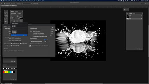
Don’t have RIP software? You can still create halftones using Adobe® Photoshop’s bitmap feature. Check out the free course on Photoshop for Screen Printing to learn how it’s done.
RELATED: HOW TO USE ADOBE® PHOTOSHOP TO CONVERT A DESIGN INTO HALFTONES
DESIGN TERMS EVERY PRINTER SHOULD KNOW
Just dipping your toes into the world of halftones? Here are a few terms you should know.
LINES PER INCH (LPI)
First up, Lines Per Inch (LPI). This represents the number of lines intersecting in every square inch. If a design has big dots, there will be a lower number of lines and a lower LPI. Small dots equals a higher number of lines across and a higher LPI.
So how do you determine the optimal LPI based on the mesh count you’re using? It’s a simple equation. Say you want to use a screen with a 160 mesh count. Take that number and divide it by 5. So for a 160 mesh count screen, the ideal LPI would be 32.
If you’re looking to push for greater detail and have a dialed-in darkroom, try a higher LPI by dividing the mesh count number by 4 instead of 5. Using a 160 mesh screen, you’d get 40 LPI. The dot size will be smaller and it will be harder to keep all that detail.
Pro Tip: To use Adobe® Photoshop and try to keep as much detail in a photograph, remember that LPI and resolution are linked. This means you won’t be able to achieve more detail on the shirt than you would see in the image at 2.5 times the LPI. If you want to keep 300 DPI (Dots Per Inch) in the photo, divide that by 2.5 to get 120 LPI.
DOTS PER INCH (DPI)
Dots Per Inch, or DPI, is the measure of the resolution of a photo. It’s also commonly referred to as PPI, or Pixels Per Inch. The ability to keep detail in DPI is directly related to the LPI, as stated in the Pro Tip above.
ANGLE
The angle of halftones refers to the slight rotation that the dot grid takes. This may sound confusing at first, so let’s break it down.
RECOMMENDED ANGLES
Dots that fall at right angles on the screen (0°, 90°, 180°, and 270°) will line up with the threads of the mesh and won’t be printable. Angles at 45° will hit the knuckles of the mesh diagonally. You’ll lose much detail when using a 45° angle.
For best results, use an angle that bisects the mesh so the dots miss as many threads and knuckles as possible. A good rule of thumb is to use 22.5° angles. This way, the dots aren’t falling on the threads or knuckles of the mesh, but between them.
DOT SHAPE
The most popular halftone shape is a round dot shape. However, they come in all types of shapes, from elliptical to square. Printers can choose the dot shape they prefer within the RIP Software.
DOT GAIN
Imagine this: you separate halftone artwork in Photoshop and it looks great. When you go to screen print it onto a garment, the image seems oversaturated and areas that should “fade” are way too dark. Those halftone dots didn’t all work together to create the masterpiece you saw on your computer screen.
Sound familiar? It’s called dot gain and occurs whenever a squeegee is pulled across a screen, causing pressure. Dot gain happens with all inks and will happen to anyone. Screen printers typically choose 30% dot gain. Check out the blog below for more information about adjusting artwork for dot gain.
RELATED: TIPS FOR ADJUSTING DOT GAIN IN ARTWORK IN ADOBE® PHOTOSHOP

There’s always more to know about halftones. The more you use them, the more you’ll get to know and understand halftones. To see a walkthrough of creating halftones in Photoshop, check out this course.
Ready to take it up a notch? Our Advanced Photoshop Course dives into pro techniques like advanced color separations and perfecting halftones.