Designing artwork for screen printing is an important first step to ensuring a good print. You need to take print order, color shift, trapping, choking, and more into consideration when designing for a job. When designing a multi-color heat transfer job, you’ll need to approach your design differently. Print expert Colin Huggins walks through the process of creating artwork for multi-color heat transfers.

ARTWORK
Before printing, your artwork and separations need to be set up properly. You’ll be printing in reverse order to correctly press the transfer onto a shirt.
The first step Colin takes is to flip the art in Adobe® Illustrator so it reads backwards. By doing this first thing, you can save yourself a lot of trouble. You can still reverse the design after you create your separations, but it’s better to do it early. To flip your design in Illustrator, simply select the design, right click, and hit “Reflect.”
RELATED: WHY PRINTERS NEED TO MASTER ADOBE ILLUSTRATOR FOR SCREEN PRINTING

Right click on the design and hit "reflect" to reflect the image.

Reflect the design vertically.
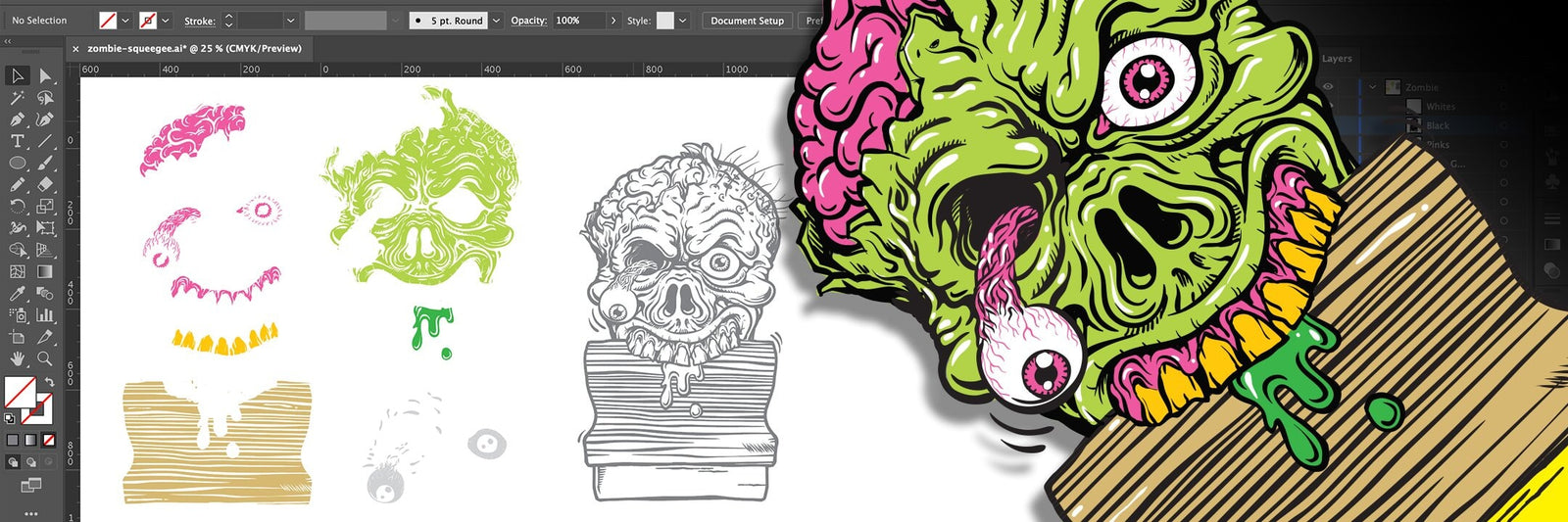
After the image has been reversed, you’ll want to make the design easy to work with. Typically, this means knocking out the background from any overlapping colors. Colin’s design has black overlapping the colors.
Since you’ll be making adjustments to the colors later by adding a stroke to them, it is important to set up the art so these changes are easily observed.
In the following video, Colin selects the whole design and uses the pathfinder option, “Divide,” to knock out all the colors from each other.
After knocking out all the colors, Colin then uses the “Unite” function to make each color a selectable object. He then puts the black on another layer below the colors, so you can easily see the adjustments to each color as it happens.
PRINT ORDER
Print order is very important when printing with multi-color heat transfers. The print order for transfers is going to be the reverse of printing shirts. You’ll print the front color first (in this case, black), then work your way back to the underbase, so that when you transfer, the design will be facing the correct way on the shirt.
There are a few differences when deciding print order for transfers versus regular screen printing. You want the most opaque colors to print early. If you have black in your design, it will always go first. For this design, Colin will be printing black first, then light brown, gold, lime green, pink (or magenta), yellow, and then white as the underbase and adhesive layer. Since most of the colors are uniform in opacity, the print order is pretty flexible.
SEPARATING COLORS
Since Colin is printing a design with a black outline around each color, he’ll need to expand the stroke of the color anywhere from half a point to a full point so the black outline covers the color when printed.
The first step Colin takes is to make sure the areas of fine detail in the design won’t close up any highlight white when he heat presses it. Since he’ll be printing this design on transfer paper, which doesn’t absorb any ink, and then heat pressing it, the design can smash out a bit. This can cause areas of fine detail that aren’t expanded enough in the design to disappear.
RELATED: HOW TO COLOR SEPARATE BLENDS AND HALFTONES FOR SCREEN PRINTING IN ADOBE ILLUSTRATOR
OVERLAPPING COLORS
The next thing you’ll need to consider are colors touching other colors. When printing heat transfers, it’s easiest to have as many of the colors in your design outlined in black, so they don’t overlap and cause color shift. Most of the colors in Colin’s design are outlined in black, but there are a few that are touching with no black in between.
This is where thinking about print order as you’re designing is very important. Everything will be printed backwards in the design, so make sure to consider which color will be overlapping the other when you print.
A few areas of Colin’s design have overlapping color. One area he doesn’t want to change are the red veins in the eyeballs of the zombie. Because the base white will be printed directly on top of these veins, similar to a solid underbase, they won’t need to be expanded or adjusted to compensate for color shift or overlapping color. Colin selects the veins and locks them so he won’t change them when he adjusts the rest of the magenta in the design.
Colin notices that the magenta in the gums of the zombie is closing in on its gold teeth. There are a couple of options to take. He can change the print order so the gold prints on top of the magenta. Since magenta is such a translucent color, it won’t show through the gold.
Another way to solve this problem is by considering how heavy you are expanding the colors under the black. If you expanded too much, take it down a notch. Not enough? Expand it a little more. Colin expands the magenta to 0.75 points instead of 1 point. By making the expansion a little smaller, the magenta is no longer encroaching on the gold teeth.
Based on what happened with the zombie’s magenta gums, Colin decides to expand all other colors by 0.75 points. In order to get the best view of how each color will sit on the transfer, bring your black layer back so it’s visible again as the “Top Layer.” This way, you’ll be able to see how your colors are going to print while you’re still in design mode.
To see the overlapping colors even better, head up to “Window.” Click on “Transparency” and set the blending mode to either “Multiply” or lower opacity so you can see the overlap. If you use “Multiply,” change the color of the black outline to grey so you can see which colors overlap each other.
FINAL STEPS
The design is really coming together now. All Colin needs to do is create and choke the underbase. You’ll want to choke your underbase so it doesn’t peek out from under the black outline when you press the transfer onto a shirt. If you’re worried about this happening, you can use a clear underbase. That way, you won’t have to worry about anything peeking out from the design when transferred.
Colin chokes the white base by half a point. If you are confident in your registration skills and keeping your design lined up, then using a white as your backer is a good choice. If you are at all unsure, use a clear as well. The clear will not show if you are out of register.
The zombie has little black hair growing out of its head. To get the hair to transfer onto a shirt, you’ll need to get a little creative if you’re using a white underbase so it covers those thin lines but doesn’t show through. Because of this restriction, you can either make the black hairs larger so the white underbase covers it, or simply use a clear underbase so you won’t have to worry about losing that detail. This decision is totally up to you and your design style.

Make sure to place your registration marks, put in your design and color info with the colors coordinated to their spot colors, and print your films as normal. There’s lots to think about when designing for multi-color transfers. Once you’re able to think backwards, though, it’ll be a breeze.