Printing posters are a great way to test out prints and get your work past the t-shirt industry. With the proper technique and a little bit of patience, you can print great looking posters without needing an advanced print shop setup. Cory Romeiser, art director at Golden Press Studio, decided to dip his toes into poster printing. He printed a two-color design on black poster (something he’s never done before).
FYI, black paper is one of the hardest paper colors to print on. The black surface makes ink colors seem more dull, because it absorbs more light than other paper colors. If you haven’t printed on posters before, start with white paper. Once you’ve got that process dialed, move onto black paper.

First, you need to create the design. Once the art had been created and printed, it’s time to make some screens.
SCREEN CREATION
In the video, Cory used a screen with a 200 mesh count. When printing posters, you have to be careful not to lay down too much ink, or you’ll lose edge definition. Water-based ink is also thinner than plastisol. If you’re worried about laying down enough ink without going overboard, a higher mesh count is the way to go.
Another important product to consider is emulsion. Your emulsion needs to be able to handle water-based print jobs. Cory used Baselayr Complete emulsion, but Baselayr Long Lasting also works great for water-based printing. He burns two screens for this job since it’s a two-color design.
RELATED: HOW TO MAKE A BETTER SCREEN FOR SCREEN PRINTING
THE INK
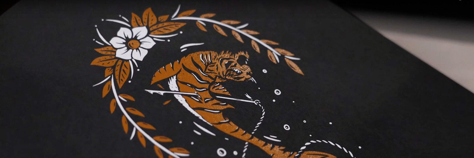
Tiger sharks (even imaginative ones) live in water. Why not print the poster with water-based ink? Water-based ink melds with the paper, whereas plastisol ink sits on top of the paper. Printing a poster with water-based ink means you’ll get a more durable print. For the design, Cory had specific Pantone colors in mind, so he mixed them himself with a water-based ink mixing system.
Pantone color books come in two versions: coated (C) and uncoated (U). For water based inks, the uncoated book works best. Water-based ink doesn’t have a glossy finish like plastisol ink does. To get the best match, use the uncoated book for a matte finish that will mimic what you see on the shirt (or poster).

Screens are ready and inks are mixed, it’s time to print.
SETUP ON PRESS
To set up for the job, he first lays down a layer of Sgreen Water Based Adhesive to get the platen tacky.
To ensure you place the paper in the exact same spot each time, you’ll need to draw some lines on your platens. First, Cory establishes a center line down the middle of the platen. Then, he sets the film positive on the platen. During the design phase, Cory had created four L-shaped brackets to establish where the poster would need to land to be in perfect registration. He makes lines on the platen based on the L brackets to ensure that his prints will be on point every time.
Once the grid is established on the platen, Cory lines the screen up to make sure the grid matches the registration marks on the screen. Once that’s done, he’s ready to print.
LET’S GET PRINTING
Cory uses 70 weight black paper to print his design. Ideally, the heavier weight the paper is, the better it will be for printing. Otherwise it can curl with too much ink or heat and be ruined. He chooses an 8.5”x11” poster. Cory first prints the white ink, then the orange (when printing multiple colors, you usually start with the lightest and go to the darkest). He prints the design wet on wet. Flashing poster paper isn’t an option, as the paper will curl and mess up your registration.
On the first try, Cory notices something wrong. The ink is translucent, dull. Even with multiple passes, it’s not showing up opaque. After talking with a few experts, Cory finds a solution.

He switches up the white ink used in the design. Rather than mixing white pigment in the custom orange Pantone color, he uses Green Galaxy Comet White ink. This makes the color a lot brighter, as Comet White is a standalone color, not a pigment for mixing. He also uses the Comet White for the white color in his design.
One pass is all he needs to know that the adjustments have worked. The print looks bright and stands out against the black background, just like he was looking for. Once he’s done printing, Cory heads to the last step: curing.
CURING
If you’re printing on posters, water-based inks can dry without any help. Simply leave them out to air dry. Once they’re dry to the touch, you’re good to go! If you want some extra insurance, add Warp Drive to your ink. It’ll chemically cure the water-based ink over a period of up to 48 hours.
Cory goes an extra step further with curing his tiger shark print. He runs it through the shop’s conveyor dryer, turning up the heat to get a full cure. The paper holds up well in the dryer. If you’re using a conveyor dryer and you see steam coming from the dryer, don’t worry. That’s the water evaporating from the ink so it can cure.

Once the prints are cured, they’re ready to go! Printing on posters can be challenging, but with the willingness to try and learn from your mistakes, you can print on paper like a pro.