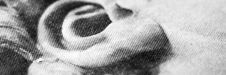
A Crash Course in Halftones for Screen Printing
Halftones are utilized in many screen print shops. They create crazy details that can be screen printed onto a garment. But what are halftones exactly? How are they created? Let’s...
Free Shipping in the Con. US Learn More
Halftones are utilized in many screen print shops. They create crazy details that can be screen printed onto a garment. But what are halftones exactly? How are they created? Let’s...

In this video from Golden Press Studio, Cory shares his top tips on how designers can talk to clients. He focuses on freelance designers or those who run their own businesses,...
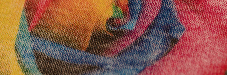
Imagine this: you separate halftone artwork in Photoshop and it looks great. When you go to screen print it onto a garment, the image looks oversaturated and areas that should...

Aligning screen printing films to a screen can be tricky. If it’s not done correctly, it can slow down your process. To avoid that, you need a way to align your screens...

ImagePrint R.E.D. is the first separations software that connects to any printer. Whether you’re printing large format photos, DTG, stickers, or film transparencies, you can use ImagePrint. Just got your ImagePrint software...
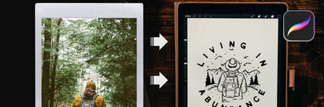
Have you ever drawn a design in Procreate and thought it was missing something? You’re not alone. Cory Romeiser, art director at Golden Press Studio, feels the same way. He created textured...
Designing artwork for screen printing is an important first step to ensuring a good print. You need to take print order, color shift, trapping, choking, and more into consideration when...

Have a ton of great t-shirt ideas but don't know how to design them? Graphic Designer Cory Romesier of Golden Press Studio will walk you through how you can create...

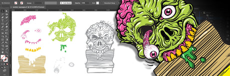
Vectorizing images is key to screen printing design. Adobe® Illustrator is an amazing tool to get everything ready to go for printing. By using tools in Adobe® Illustrator, you can...
The dreaded blank document. All that white space, waiting to be filled with all those ideas floating in your head. But where do you even begin? To make those ideas...
Have you ever wanted to screen print CMYK, but didn't know where to start? Here's a crash course. In the video, print expert Colin Huggins shows you how to do...

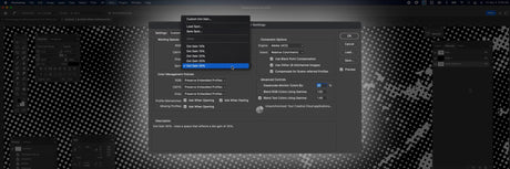
Learning to design screen printing art in Adobe® Illustrator can take some time and practice. Clicking multiple buttons for one action—especially one you use all the time—can become tedious and...

Procreate is an amazing design tool. Wouldn’t it be even more amazing if you could print film from Procreate? You sketch, draft, and finalize a design in Procreate, so why...